Description of the picture:
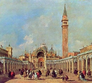
Piazza San Marco – Francesco Guardi. 1760-1765. Canvas, oil. 91×61 cm
This picture is an ordinary Venetian “Veduta”, in other words, a city landscape reflecting the daily life of the town since then. In the era when the master worked, many great painters worked in this genre, but the name of Guardi was not lost among them. Despite the fact that the canvases depicted similar towns and actually captured similar pieces of life, the brush of this master is perfectly recognizable.
One of the huge number of recognizable paintings by the artist is the image of the heart of Venice – St. Mark’s Square. This picture immediately makes it clear to the viewer that in front of him is a work of a talented person. A clear and correct perspective, competent transfer of many large and small architectural details, as well as the highest level of ownership of paints – all this distinguishes Guardi’s work from paintings by other Veduta masters.
On the canvas before us extends a large open area, paved with large, square slabs of light-colored stone. On both sides it is bounded by two massive dark buildings, as if consisting of several rows of identical arches. These buildings play the role of a kind of visual milestones, directing the views exactly into the distance – towards the closing square of St. Mark’s Cathedral. This masterpiece of Byzantine architecture involuntarily attracts attention, but it immediately shifts to a belfry that literally thrusts a needle into the sky with a height of as much as 100 meters. It seems that architecture plays a major role on this canvas.
But it is not so. A lot of human figures scattered throughout the square in bright and elegant clothes. This idle walking wealthy population of Venice came out to boast of its beauty and wealth. A tall sky with light fluffy clouds spread over this motley crowd.
Straight lines of architecture are even more emphasized by the even stripes of shadows cast on the square and people. But these shadows are not as dark and all-consuming as those of Caravaggio and not as significant and ambiguous as those of Leonardo da Vinci. For all their richness, they do not hide a single detail or character – even in the deepest shadow you can clearly see the figures of people.
Some downward bias fills the picture with air, without making space constrained by rigid architectural forms. Light colors in pleasant muted tones contribute to ease of perception. Against their background, the bright colors of people’s clothes seem to be literally explosions of color."